Join for FREE | Take the Tour Lost Password?
Shop deviantART for the
holidays and save BIG!
Click here! :holly:
[x]

deviantART

:omfg:
 
©2006-2009 ~emperial
:iconemperial:

Artist's Comments

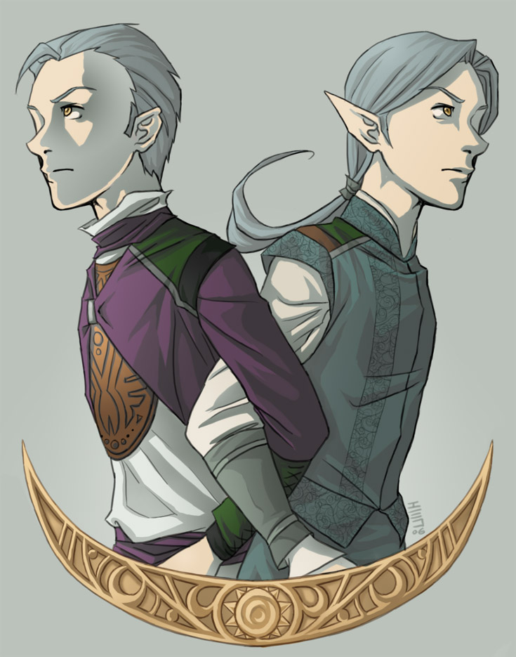
It's amazing what even a fraction of a light-second difference makes. In one dimension a prince, in the other a pauper (or, more accurately, a mercenary). Had they been born in the same dimension they would have been twins. Together they are brothers.

Back to commission work now!


EDIT: Fixed a few details I noticed and added the detail to Philemon's outfit which I had originally intended to be there, but hadn't been able to pull off. So now he looks a bit more princely, as he should.

Comments


love 0 0 joy 0 0 wow 0 0 mad 0 0 sad 0 0 fear 0 0 neutral 0 0
:iconjazz-teh-rudie:
Interesting how different your style in this piece looks from the last one. Nice job, keep up the great work! :D

--
You're here in the dark, in a little box, with a fella' who might know less than you. And you'll go on home and lock the locks, another box to climb into...
:iconkecky:
Wow, I really like how smooth and clean this all is. Great composition too! :D

--
in a world of apples and kisses and shoes -
he wasted his wishes on wishing.

etsy shop!!!
:iconvoici:
Nicely shaded. I like the way you've mirrored it and made it all smoothy smooth

--
2, 4, 5, 5, 5
:iconbefore-i-sleep:
Wow, awesome, I love them! :heart:

--
"I am the Bad Wolf. I create myself. I take the words...I scatter them, in time and space." - Rose Tyler, Doctor Who
:iconemperial:
Thank you!

--
Quack quack!
:iconemperial:
Style? What style? ;D lol! If I could keep a consistent style from one piece to the next... I probably wouldn't, even though more consistent style seems to lead to more popularity.

--
Quack quack!
:iconemperial:
I'm glad! Looking forward to Stargate tonight? ;D I know I am!

--
Quack quack!
:iconemperial:
Hee, thanks. I used a really different technique than usual. All the color was on one layer, and then I had a layer for gradient highlight, and three layers for the shadows -- one layer for the shadows on the skin and shirts (which are light in color) and two for the other areas... although one of the two layers was just saturation adjustment.

I tried to work the shading of the piece into harmony with the background color, and I think it worked out nicely. :)

--
Quack quack!
:iconvoici:
it did indeed!

--
2, 4, 5, 5, 5

Details

January 19, 2006
152 KB
735×935

Statistics

18
21 [who?]
401 (0 today)

Share

Link
Embed
Thumb

Site Map